Background
Dreamscapes Healing Arts is a virtual healing collective. Dreamscapes' founders, Jessi and Sonya, developed the company during the covid pandemic as a way to introduce healing and community during times of isolation. Key offerings include reiki, reiki training, group sessions and courses.
One barrier — they wanted to work with someone who could respectfully and enthusiastically present their services and story while translating the core elements for a digital audience, ensuring that their core audience can both find and understand their work. They also wanted to understand the ins and outs of the brand. As a lover of science who has also found restoration in alternative healing methods, we found the perfect partnership.
Scope
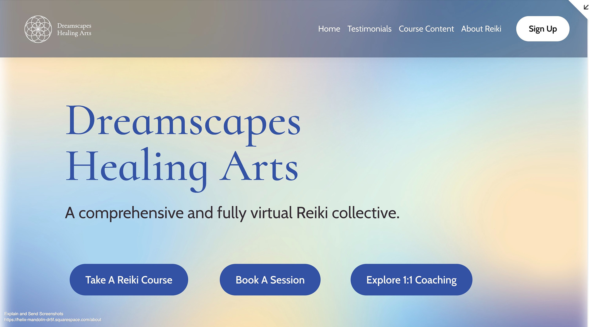
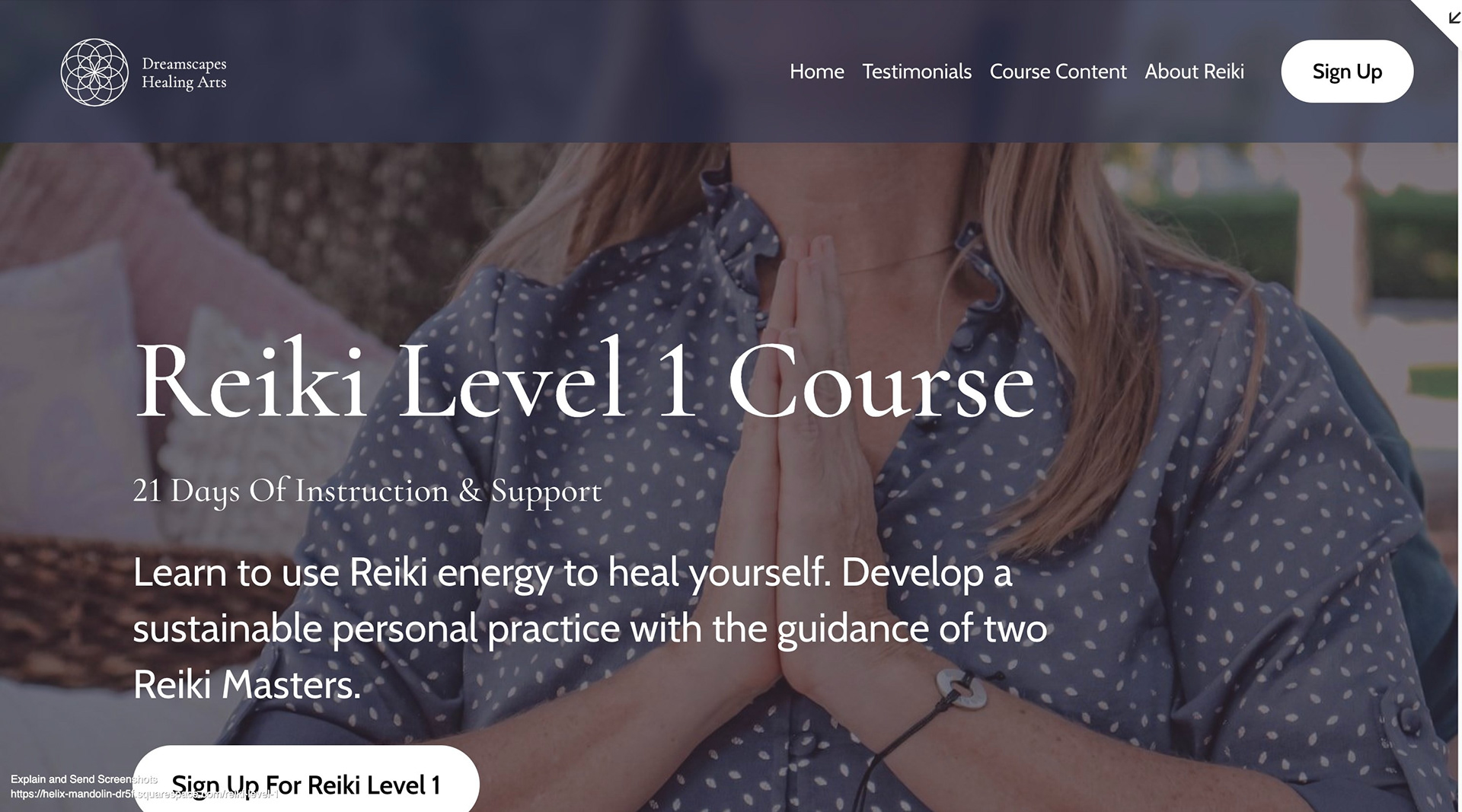
Dreamscapes required a brand identity, logo and sales page design. They also required strategic positioning of their offers, expressed through clear, accessible copywriting. I offered all of these services "under one roof," ensuring a cohesive audience experience and smooth design process.
Where we started: they didn't have a logo, their URL led to a "coming soon" page, and they were sending course information via plain text email.
Where we ended: they had a full brand guide, set of logos, backgrounds, UVPs, offer positioning, SEO-friendly copywriting and a fully designed sales page on Squarespace.
discovery
Creative tensions
Healing, intuition, creativity | Trustworthy, science-backed, professional
Arts, connectivity, ease | Marketing, target audience, business
High potential future | Current financial constraints

Research
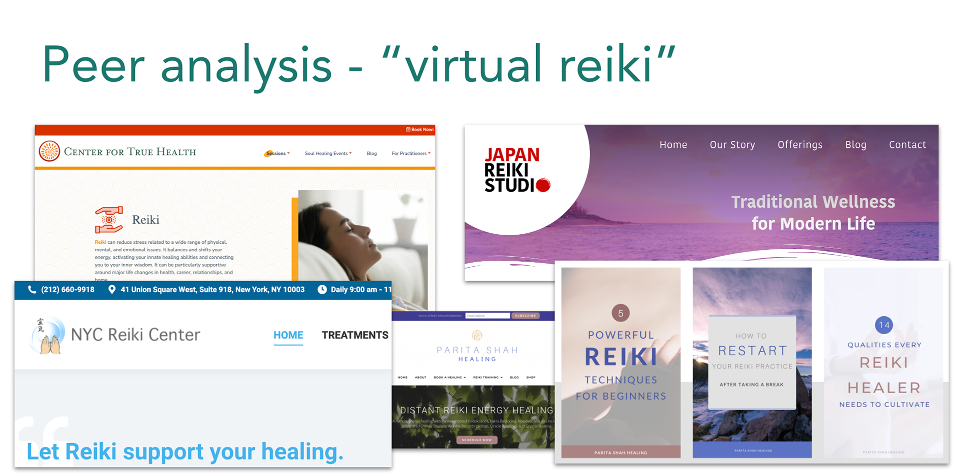
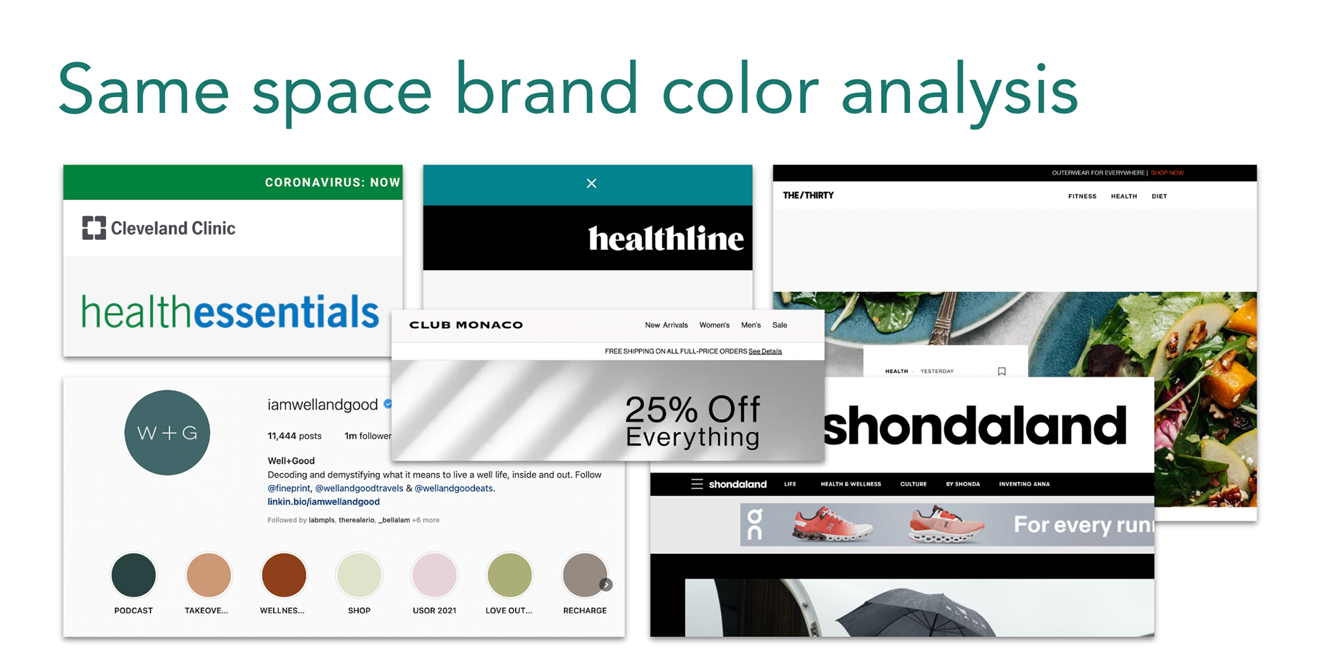
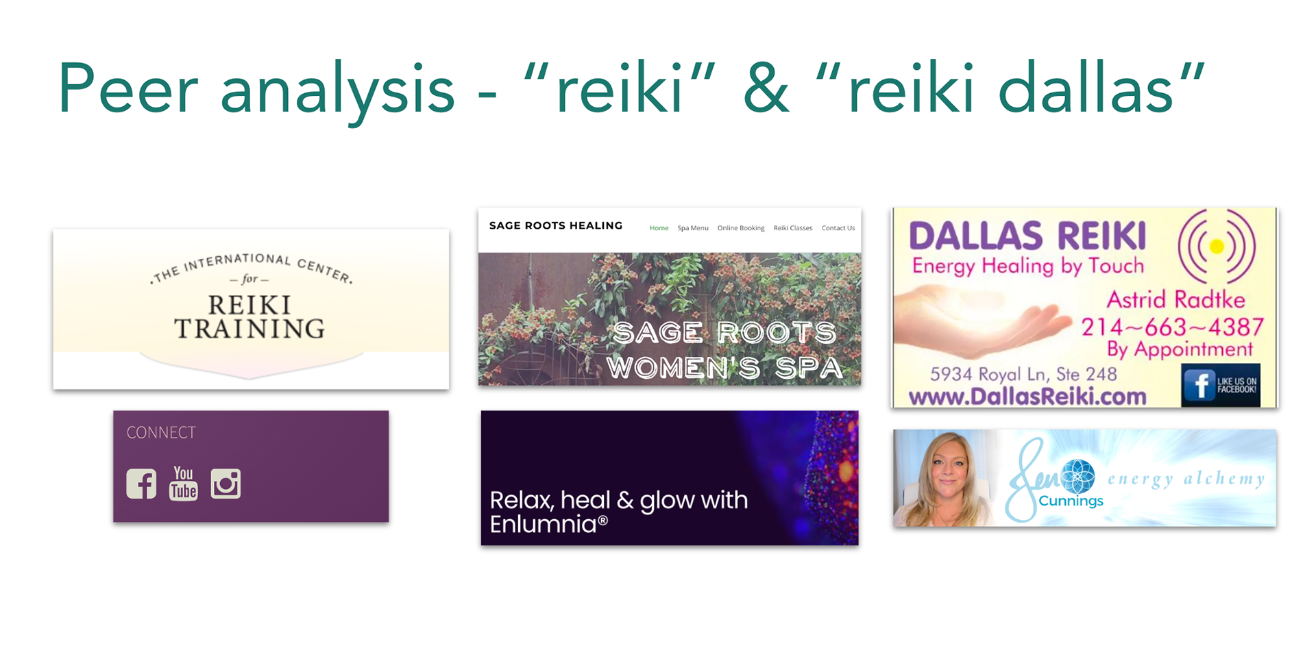
A same-space analysis with three dimensions revealed a strong use of purple and yellow for the virtual reiki space. Meanwhile, brands reaching the core audience from different sectors drew on one or two bold, saturated colors. The larger reiki centers landed somewhere between the two. Blue and blue-adjacent colors appeared in the health sector as well.
It became clear Dreamscapes did not need to show its dreamy nature through a purely dreamy color palette. In fact, purple/yellow would likely fail to differentiate them from other small shops. A confident palette with room for strong contrasts on a white background would position them well against other brands reaching their audience of professional, mid-career women. An effective palette would offer softer supports to the bold primary color.
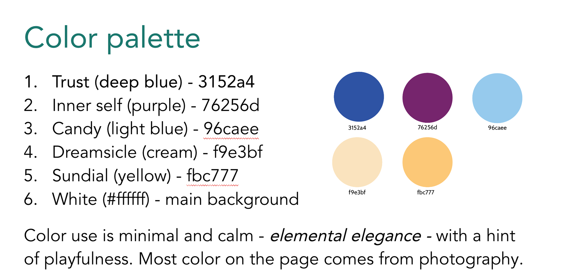
Colors
The Dreamscapes color palette is based around with a deep, welcoming blue. We started with a straightforward, medium shade similar to the trustworthy blues of research and healthcare websites. We then deepened the blue to add a sense of creativity and nighttimeness (is that a word? :)).
This color exemplifies the branding balance Dreamscapes needs to strike between intuition / mystery, and results-based / professional perception.
The Dreamscapes team also requested a candy look—something playful, delicious and appealing. While they sought an approachable, minimalist-ish dynamic, it was important they not appear dry.
The final palette offers a mix of bold primary tones with lighter candy tones. It carries messages of morning/evening. While it includes the purple that represents creativity to so many, the palette isn't dominated by it.
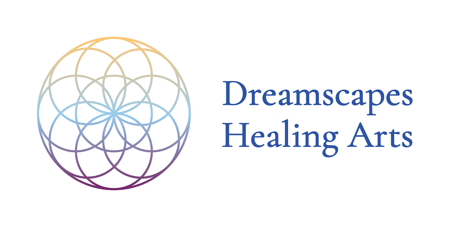
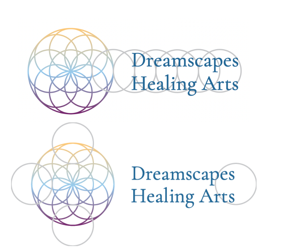
Logo

The Dreamscapes logo utilizes sacred geometry (the "seed of life"). It conveys balance, universality, grace and welcome. Associations include the math-based architecture of European cathedrals, as well as the mystery of the divine feminine. The flower represents growth and seed-starting.
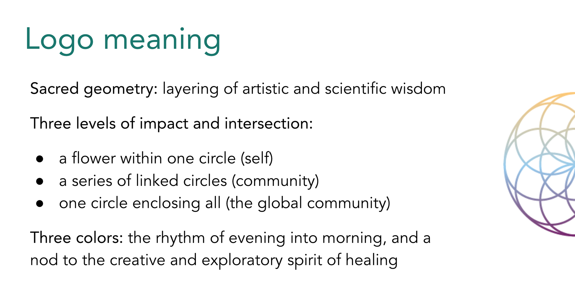

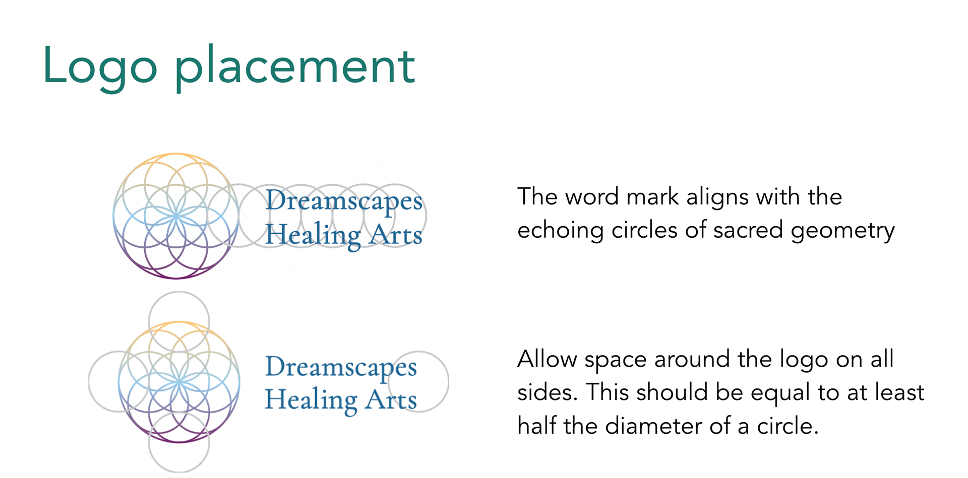
For me, the most significant story is "one" / "many." The logo is a complete circle which is itself made up of overlapping circles with one smaller circle at the center. What a powerful statement about community being made up of individuals who give and receive mutual support. This metaphor will grow with Dreamscapes as they expand into a larger collective. It will also lend itself well to animation.
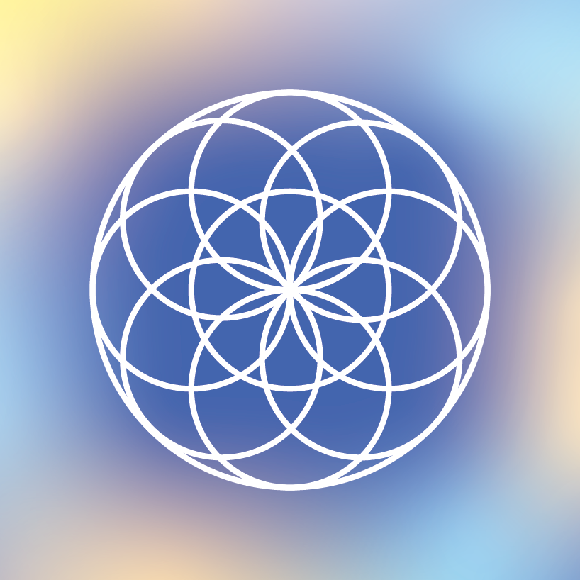
Two main variations came to the forefront during the design process: (1) a white outline on soft mesh gradient background, which shows the structure offered by Dreamscapes within a broader world of possibility; and (2) an outline in the core brand colors, which brings a more subtle, minimalist effect while still evoking the creative nature of the brand. The colors are deep enough to appear clearly even in a smaller format.
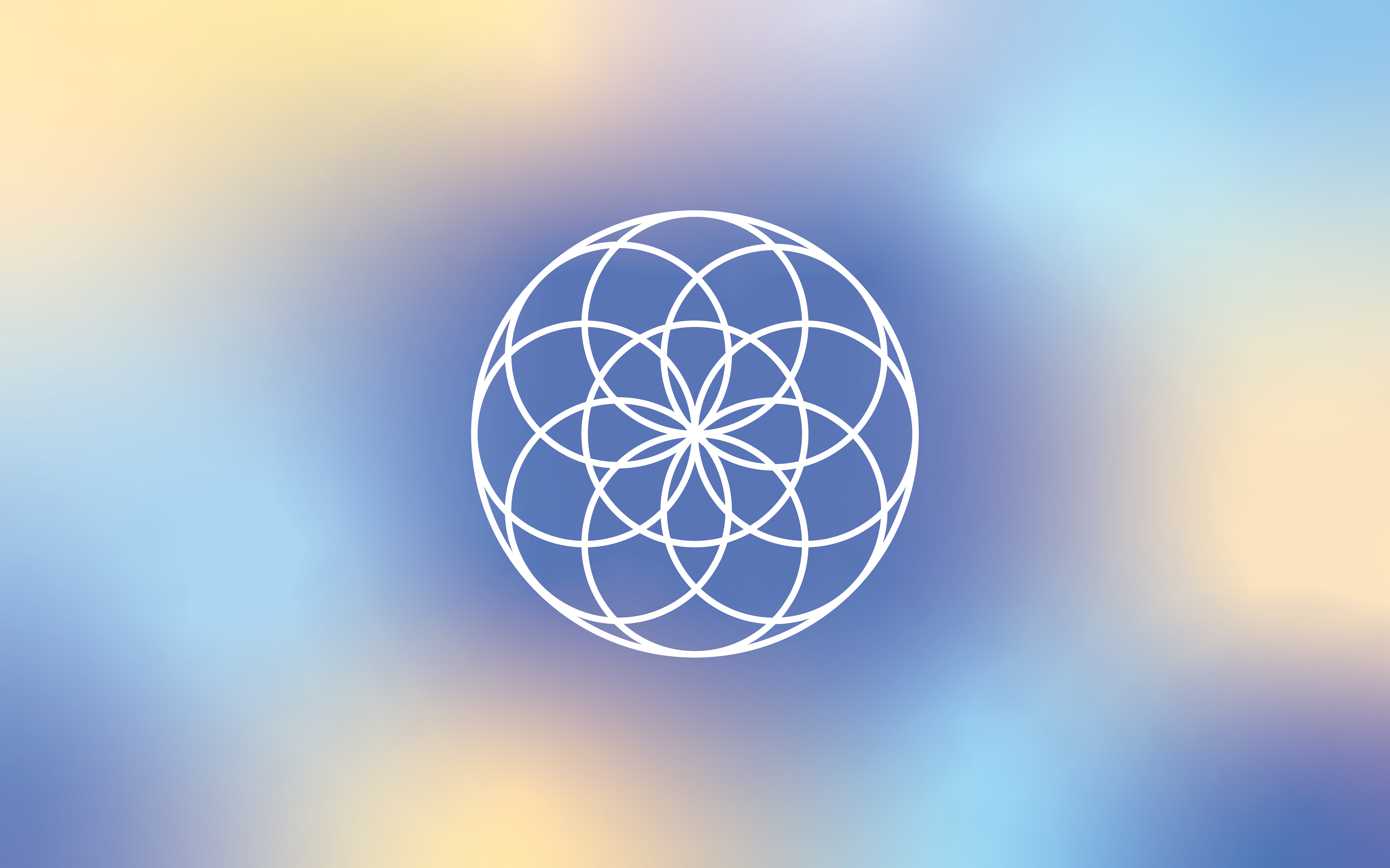
The logo uses a rich gradient tone to embody a sense of healing rhythm — morning, mid-day, twilight.
Font
Title & header font: Cormorant Garamond is graceful and mature, with a hint of intrigue to invite further exploration.
Body font: Cabin is clean, professional and readable.
These are accessible on multiple platforms for ease in design. They take subtle inspiration from the dreamy brand story, but are also grounded.
Supporting assets
The background visuals offer moods across the brand story, from dawn to deep twilight.


see it on the website